Sono
The modern training platform for high growth startups
Overview
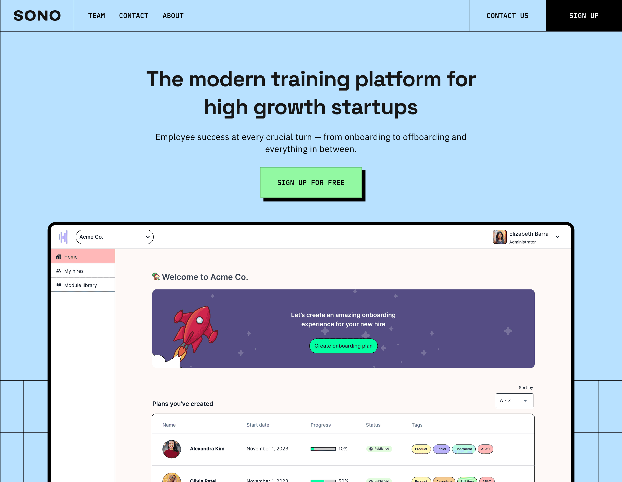
Sono is an employee onboarding platform that helps people teams and managers onboard, train, and retain employees.
Role
I joined Sono as head of design and was entrusted with helping create the company's vision.
I set the company design foundation by:
Establishing user-focused product development processes for shaping, researching, prioritizing and shipping features.
Creating and maintaining our design system, which greatly increased our shipping velocity while maintaining a high standard for design.
Advocating for and establishing a user research practice by educating stakeholders about the importance of conducting research in product development.
Collaborators
CEO, Co-founder and product manager
CTO, Co-founder and lead engineer
Co-founder, engineer
Problem
Creating onboarding plans for new hires is a painstaking process; prone to errors and miscommunication causing employees to experience a poor initial impression of the company they just joined. Studies have shown how a poor onboarding experience can lead to poor retention. Employees who left in the first six to twelve months cited reasons like feeling out of sync with the company's culture or mission, not understanding the employee's impact, and discovering that their tasks or responsibilities were not as described.
Most onboarding plans are built on tools like Google Docs or Notion. These tools weren't built for onboarding and training use cases. Onboarding content is typically copy and pasted from other company sources. When company documents are updated, the onboarding content becomes outdated. Companies also typically reuse content with slight adjustments for different teams. Creating plans at the growth stage is time-consuming because tools like Google Docs aren't built to scale plans as team size grows.
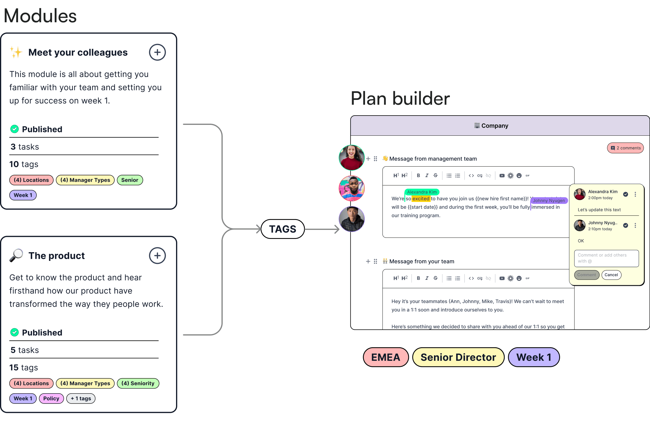
When I joined the company, the product had a basic flow for plan creation, akin to creating plans on Google Docs; tedious and singular. However, that was about to change with the launch of reusable module library and team tags. Hiring teams could now label team-specific modules with tags that could be used to build plans across a range of teams while ensuring the modules could be kept up-to-date by assigning module owners the ability to create and update content. I was tasked with creating the entire feature set, working closely with the founders to shape, test, and launch the feature.
Opportunities
Growth
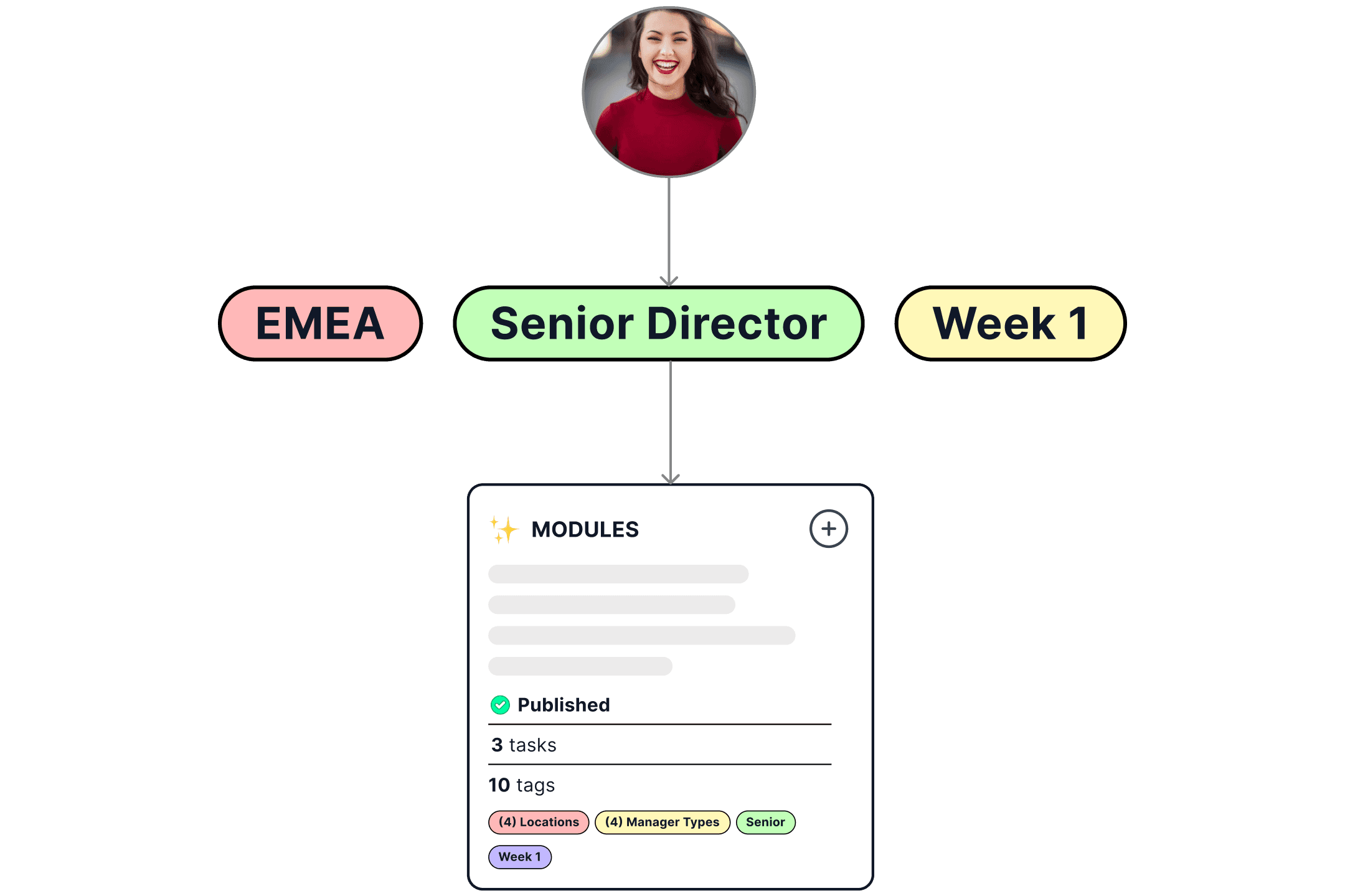
With tags, the ability to create personalized plans at scale could be realized. With just a few clicks, hiring managers could assign tags and immediately create plans with all the right modules added. This critical aha moment could be made possible with tags and would drastically reduce user time-to-value.Expanded use cases
Tags could help us grow beyond our initial set of users (hiring managers). With tags, teams from product, engineering, and sales could build training modules to help train and retain employee.
Design system
To bring this feature to life we assessed our current plan creation experience. It was necessary to make the user flow easy to complete, since adding tags to this flow could add friction if not done correctly. To accomplish this, we explored different ways to encourage flow completion. But first, we needed to add new components to our design system. Some new components we added include:
Tags
Progress indicator
New dialog illustrations
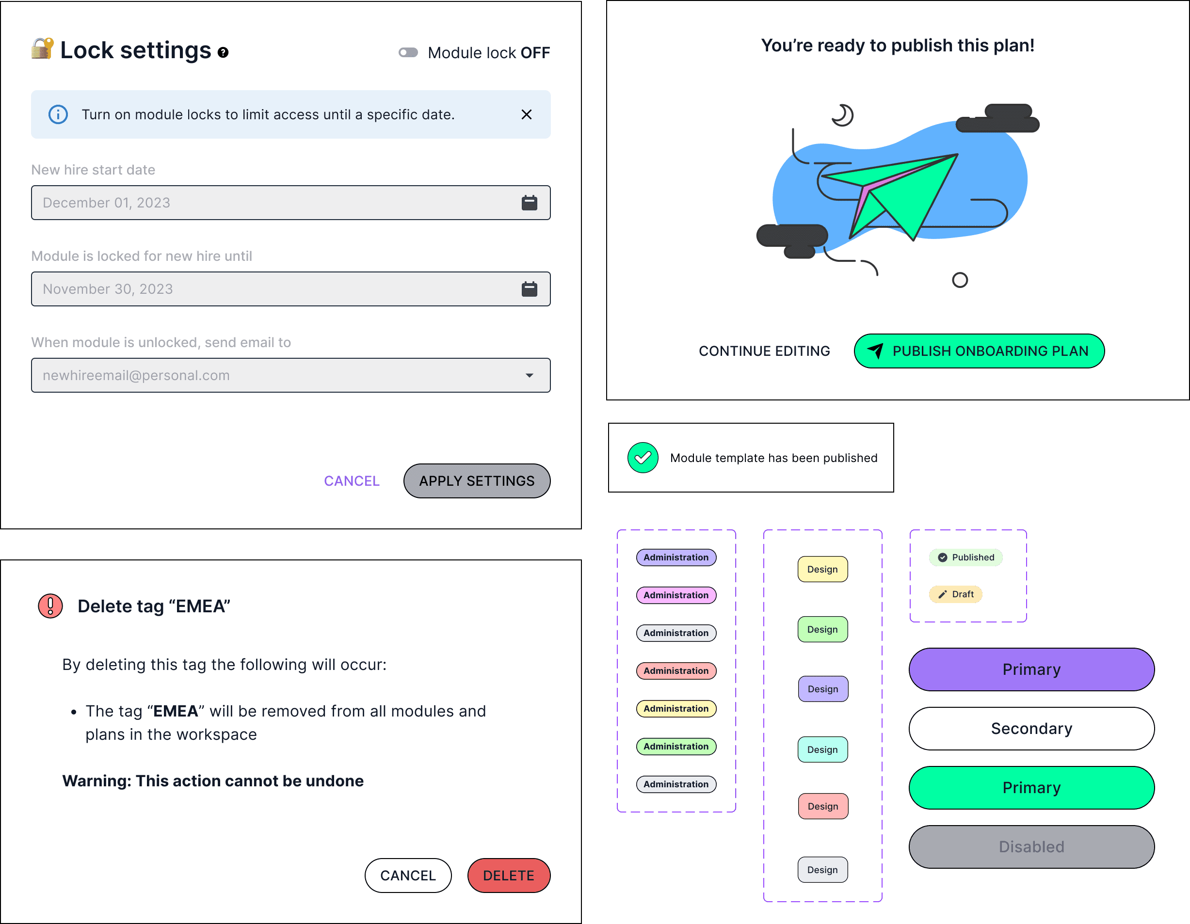
The existing design for initializing an onboarding plan looked like this:
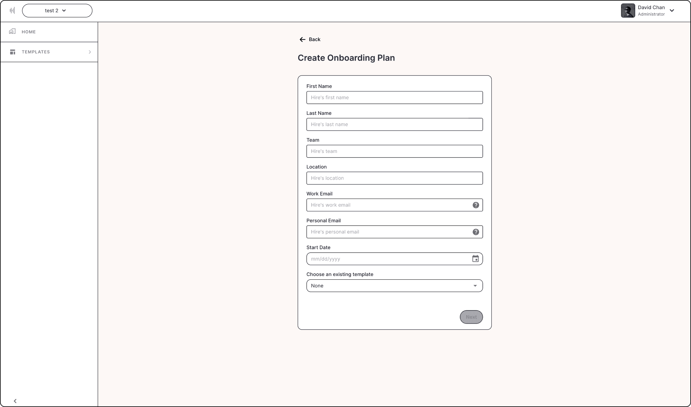
There was already an existing user flow for managers to create plans, but it did not include tags. We had some ideas of where to bring in tags in the creation flow, but needed to work very closely with users to ensure it didn’t add friction.
Key problems with the existing onboarding page
The onboarding plan page didn’t encourage users to complete the form fields
There were too many fields to complete before taking them to the builder (the ah-ha moment)
Visually, the design felt flat and did not motivate users towards completing their job (create an onboarding plan)
Research
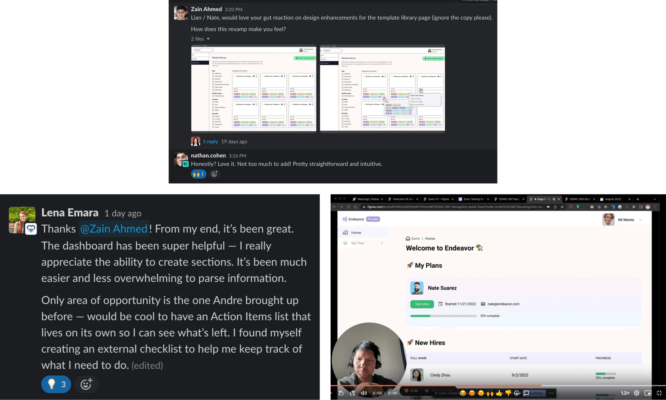
Design partners (or champions) were important to us, so I made sure to listen to them and collect their feedback. While I had done onboarding and wizards before, it was important for me to remain unbiased and to value user feedback. I did this by participating in weekly calls to gain empathy with users and also monitored our slack channels and promptly responded to them. I regularly shared exploratory designs w/ teammates and design partners to solicit their feedback asynchronously.
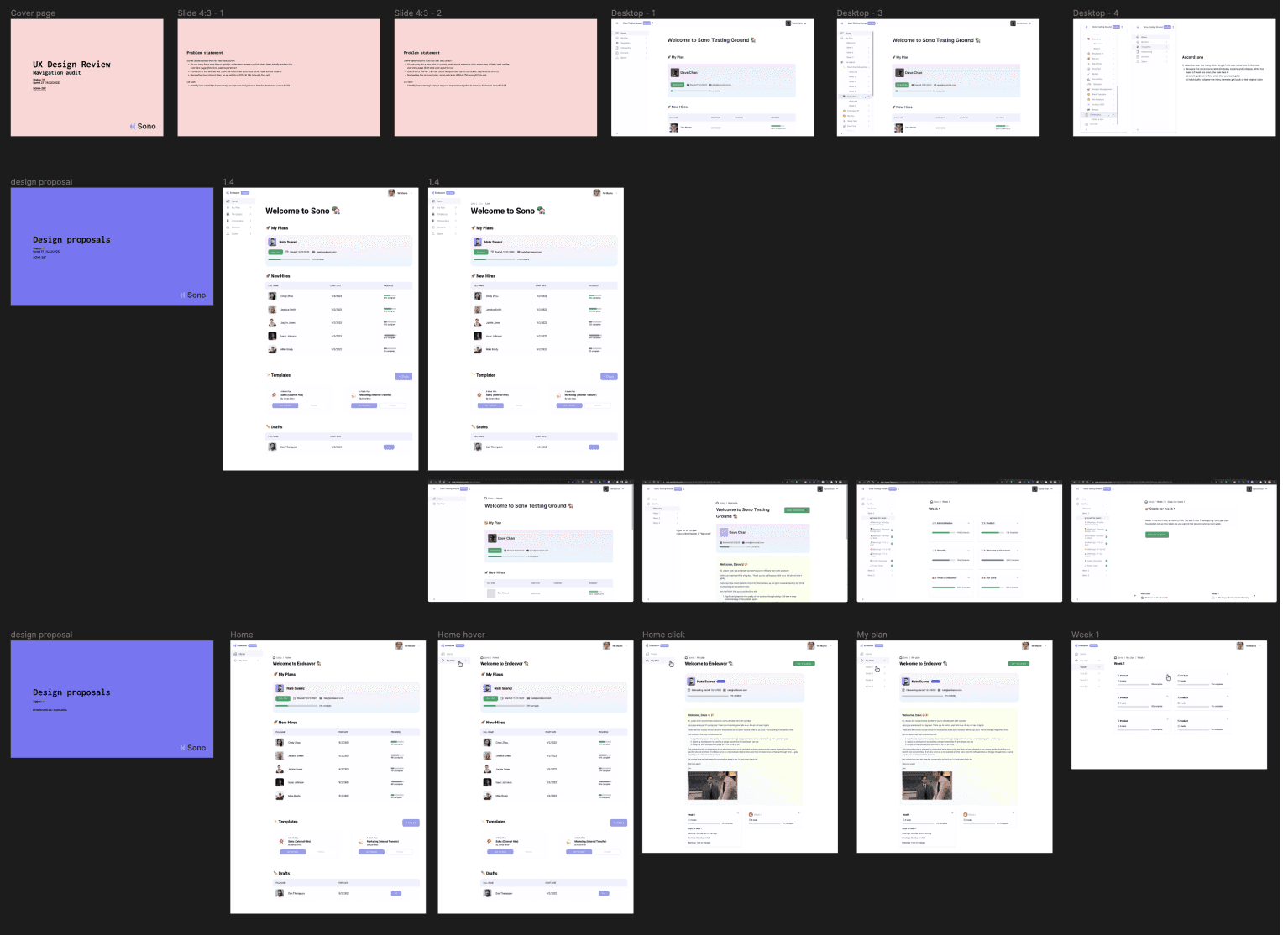
The audits on the existing user flow also provided us a clearer overview of the entire end-to-end and allowed us to locate areas friction by removing unnecessary steps.
Challenges
Our main challenges during this project were:
Research: There weren’t enough users on the platform to make design decisions backed by quantitive research
Information architecture: I was uncertain how the interface could support tags and whether we would be able to ship the tag feature on-time while maintaining a high standard for user experience
Module library: We were planning to launch module libraries near the same time as tags. We had the challenge of design both features simultaneously while understanding the initial release of modules would not include tags. The design had to be flexible enough to accommodate this decison.
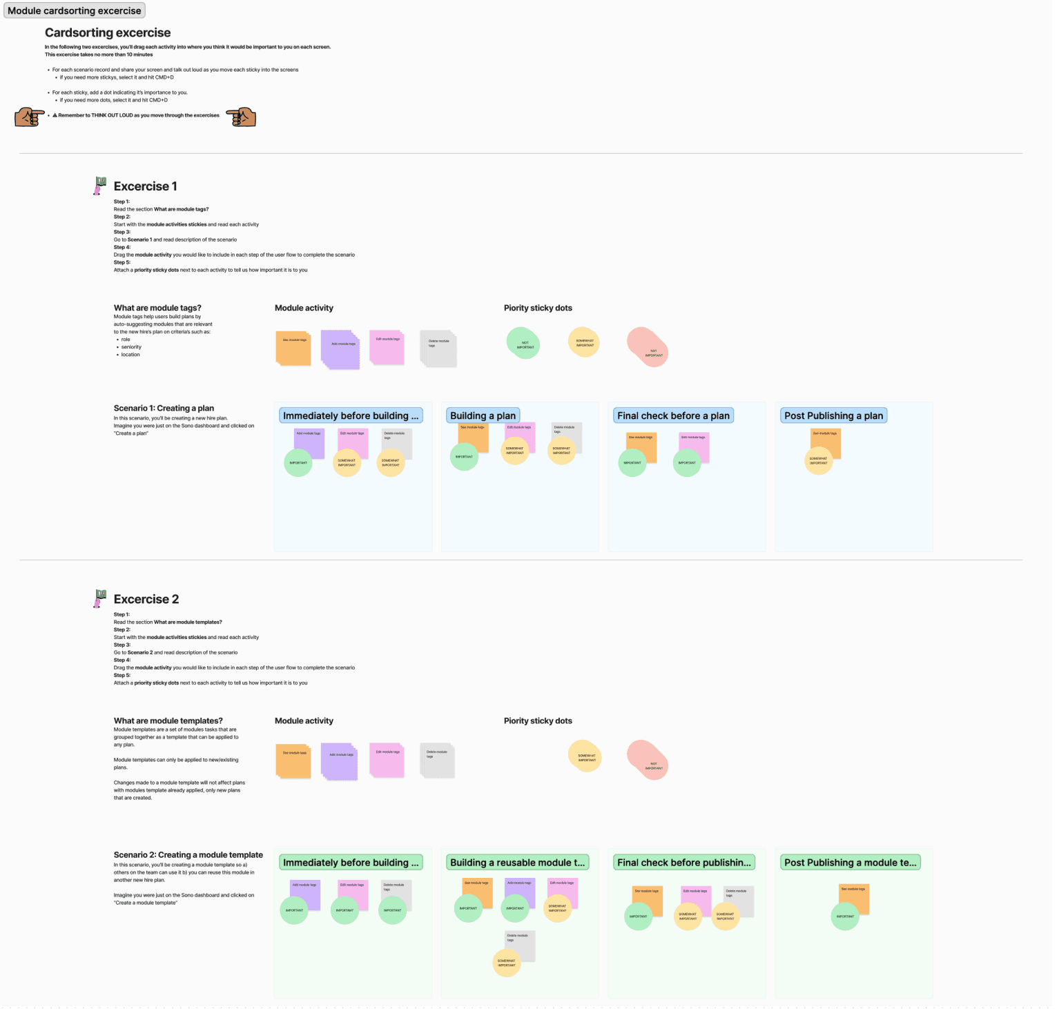
As a team, we weren’t aligned on whether it would be important for users to see tags in the builder anymore since it could be a distraction from the core job; to build and preview the plan they were going to deliver to new hires.
To come to an agreement and gain a better understanding of the problem, we decided on a closed card sort exercise with a few of our champions who volunteered their time. I also worked closely with the engineering team to understand the typical number of tags being used in plans currently.
Exploration
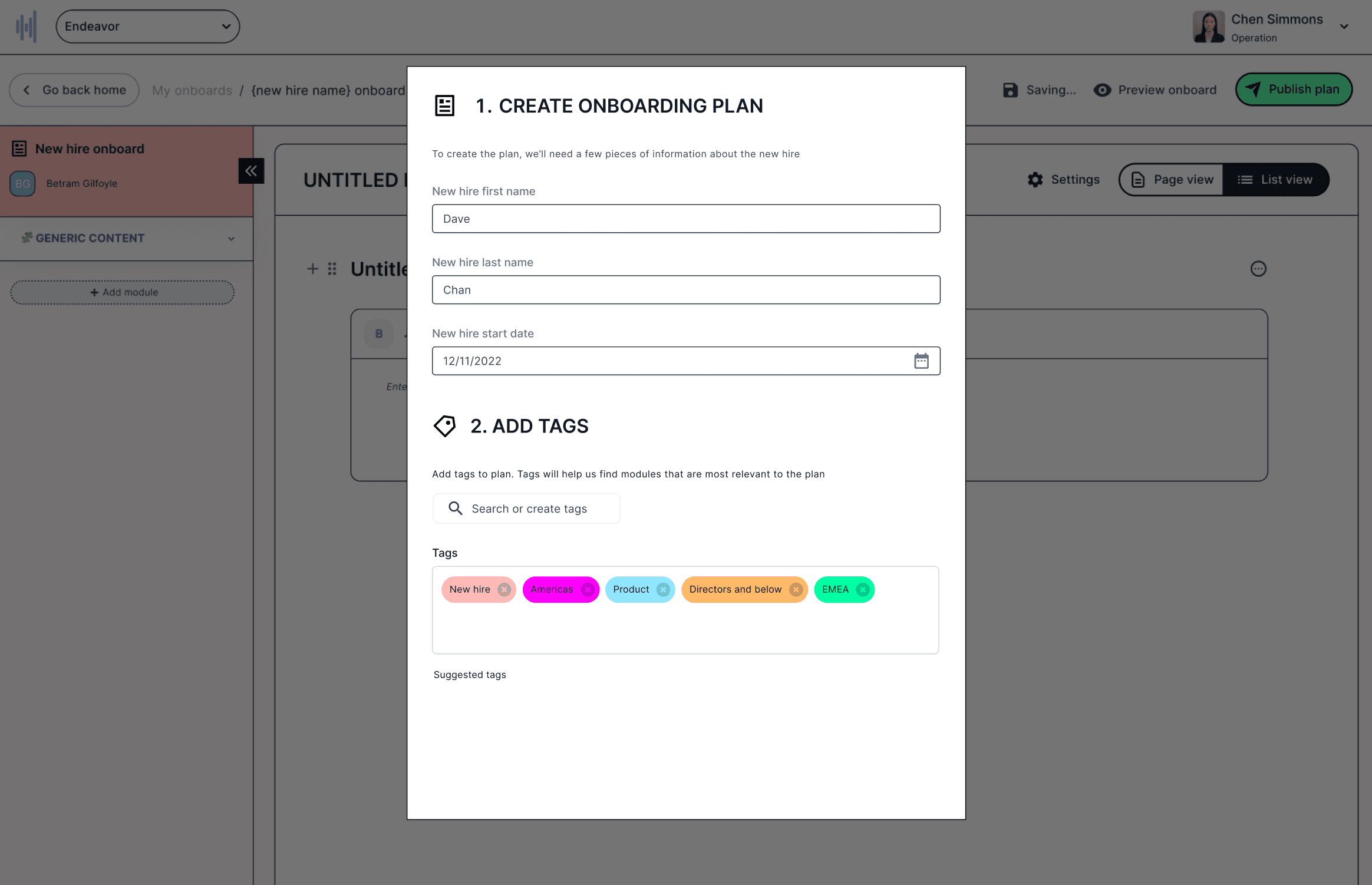
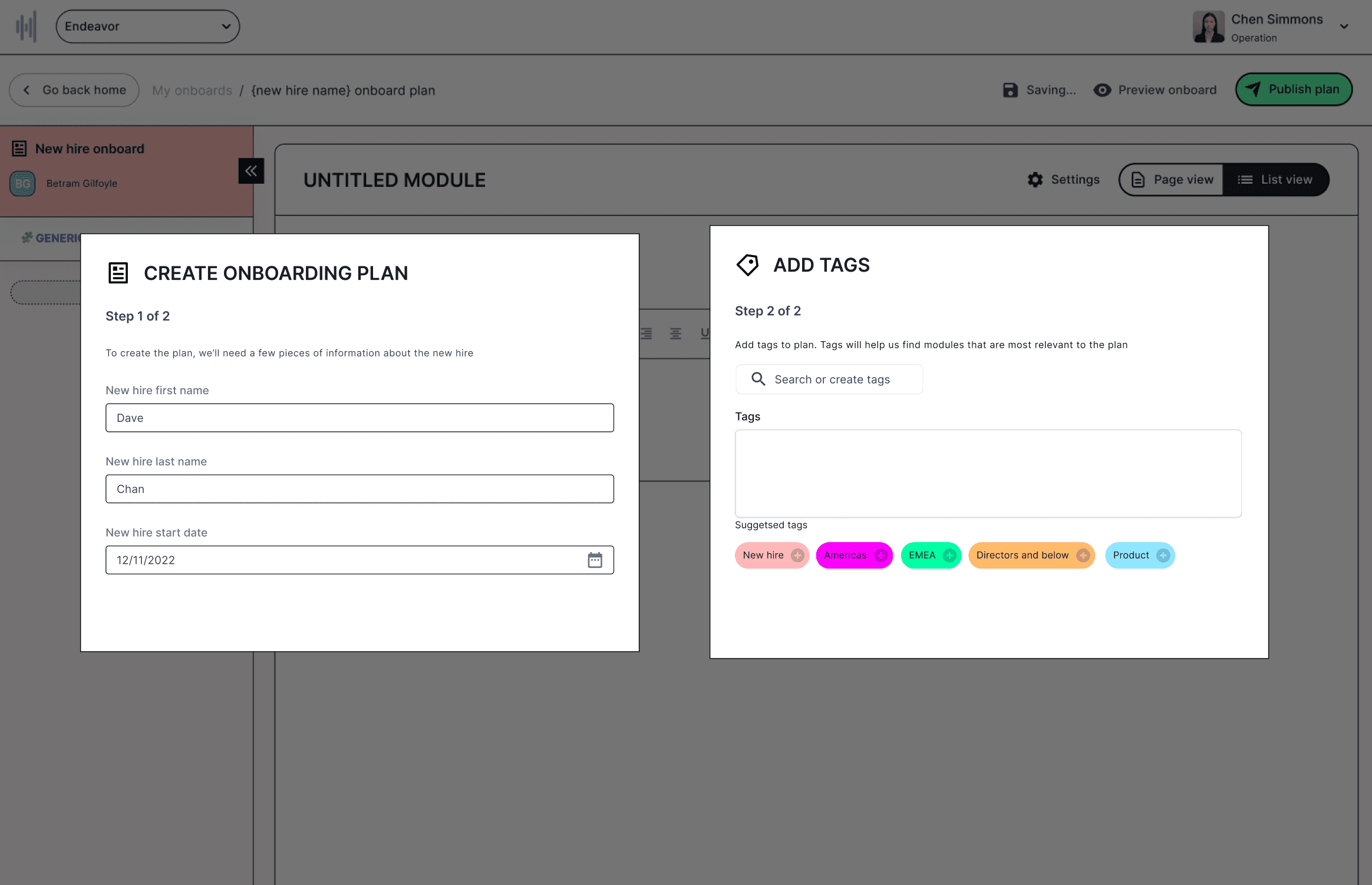
We explored different variations of onboarding designs. The designs were to:
Encourage completion
Show the value of tags
Give users a sneak peek of the builder (which would provide them a positive anticipation of what was to come next)
Final design
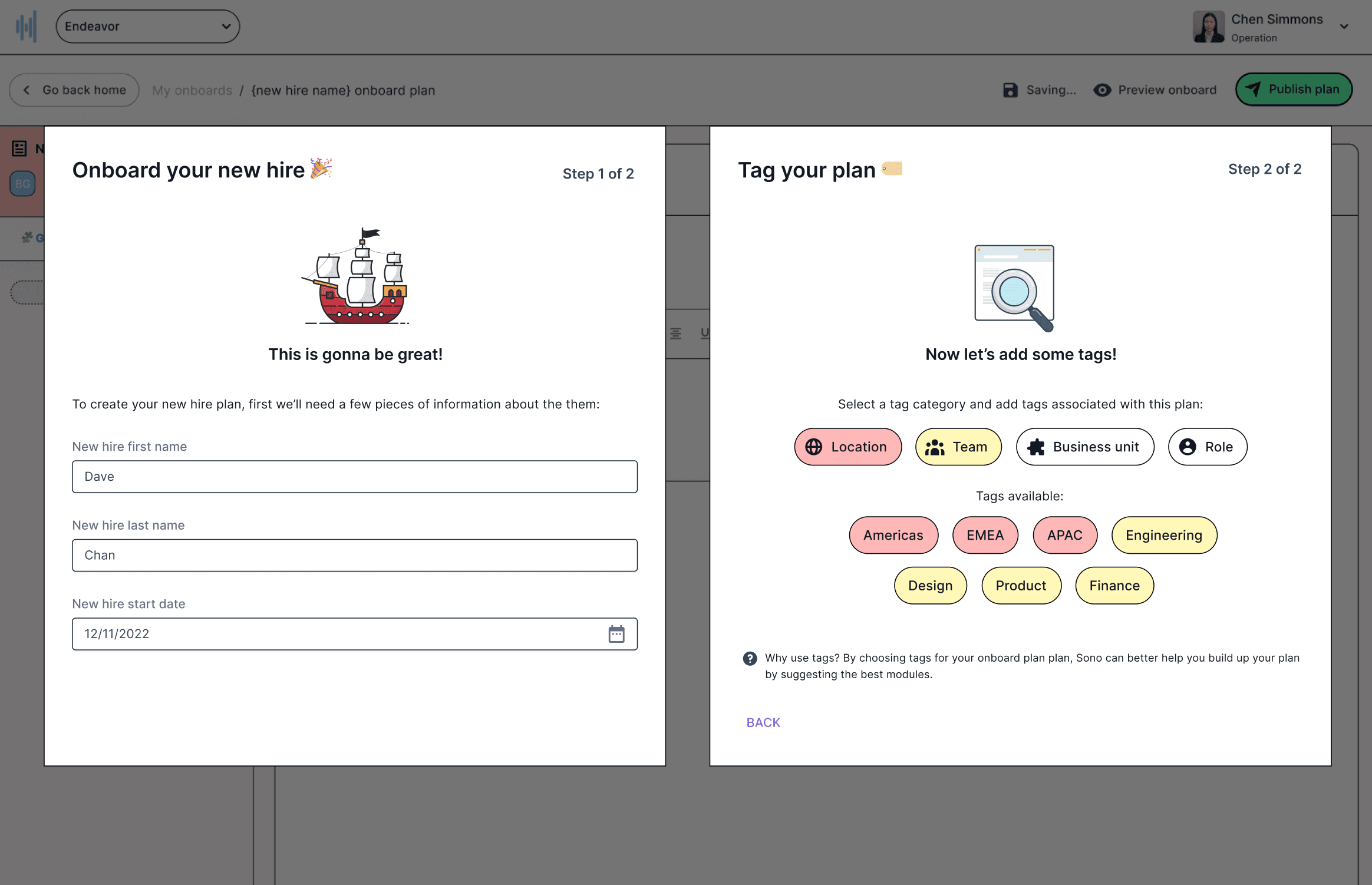
Our final design was tested with users who felt it was pleasing aesthetically, which gave created the positive reaction we had hoped for. They not only understood the importance of tags, but were eager to complete the flow to begin building plans.
As a result of launching tags:
We saw an immediate uptick in the number of plans created, with a shortened amount of time between creation and deployment.
We saw teams creating their own tags without the need for white-gloved support, lower time dedicated to customer success.
We saw more content being created on Sono, which meant teams were more invested in our platform.
We began speaking with teams beyond our original use case such as sales and customer support.
Closing thoughts
Here are my main takeaways from the project:
Talk to users: Our workshop helped us identify what was most useful at each stage of the plan creation process, increasing our confidence it would help deliver the promise of Sono.
Scalable designs: Designing at a startup is very different from designing at a larger company; while scalability increases the ROI of design for large organizations, scalability at startups could the difference between raising your next round or not. What's most important is to ship useful features often, learn quickly, and iterate.
Sono
The modern training platform for high growth startups

Overview
Sono is an employee onboarding platform that helps people teams and managers onboard, train, and retain employees.
Role
I joined Sono as head of design and was entrusted with helping create the company's vision.
I set the company design foundation by:
Establishing user-focused product development processes for shaping, researching, prioritizing and shipping features.
Creating and maintaining our design system, which greatly increased our shipping velocity while maintaining a high standard for design.
Advocating for and establishing a user research practice by educating stakeholders about the importance of conducting research in product development.
Collaborators
CEO, Co-founder and product manager
CTO, Co-founder and lead engineer
Co-founder, engineer
Problem
Creating onboarding plans for new hires is a painstaking process; prone to errors and miscommunication causing employees to experience a poor initial impression of the company they just joined. Studies have shown how a poor onboarding experience can lead to poor retention. Employees who left in the first six to twelve months cited reasons like feeling out of sync with the company's culture or mission, not understanding the employee's impact, and discovering that their tasks or responsibilities were not as described.
Most onboarding plans are built on tools like Google Docs or Notion. These tools weren't built for onboarding and training use cases. Onboarding content is typically copy and pasted from other company sources. When company documents are updated, the onboarding content becomes outdated. Companies also typically reuse content with slight adjustments for different teams. Creating plans at the growth stage is time-consuming because tools like Google Docs aren't built to scale plans as team size grows.
When I joined the company, the product had a basic flow for plan creation, akin to creating plans on Google Docs; tedious and singular. However, that was about to change with the launch of reusable module library and team tags. Hiring teams could now label team-specific modules with tags that could be used to build plans across a range of teams while ensuring the modules could be kept up-to-date by assigning module owners the ability to create and update content. I was tasked with creating the entire feature set, working closely with the founders to shape, test, and launch the feature.

Opportunities
Growth
With tags, the ability to create personalized plans at scale could be realized. With just a few clicks, hiring managers could assign tags and immediately create plans with all the right modules added. This critical aha moment could be made possible with tags and would drastically reduce user time-to-value.Expanded use cases
Tags could help us grow beyond our initial set of users (hiring managers). With tags, teams from product, engineering, and sales could build training modules to help train and retain employee.

Design system
To bring this feature to life we assessed our current plan creation experience. It was necessary to make the user flow easy to complete, since adding tags to this flow could add friction if not done correctly. To accomplish this, we explored different ways to encourage flow completion. But first, we needed to add new components to our design system. Some new components we added include:
Tags
Progress indicator
New dialog illustrations

The existing design for initializing an onboarding plan looked like this:

There was already an existing user flow for managers to create plans, but it did not include tags. We had some ideas of where to bring in tags in the creation flow, but needed to work very closely with users to ensure it didn’t add friction.
Key problems with the existing onboarding page
The onboarding plan page didn’t encourage users to complete the form fields
There were too many fields to complete before taking them to the builder (the ah-ha moment)
Visually, the design felt flat and did not motivate users towards completing their job (create an onboarding plan)
Research
Design partners (or champions) were important to us, so I made sure to listen to them and collect their feedback. While I had done onboarding and wizards before, it was important for me to remain unbiased and to value user feedback. I did this by participating in weekly calls to gain empathy with users and also monitored our slack channels and promptly responded to them. I regularly shared exploratory designs w/ teammates and design partners to solicit their feedback asynchronously.

The audits on the existing user flow also provided us a clearer overview of the entire end-to-end and allowed us to locate areas friction by removing unnecessary steps.

Challenges
Our main challenges during this project were:
Research: There weren’t enough users on the platform to make design decisions backed by quantitive research
Information architecture: I was uncertain how the interface could support tags and whether we would be able to ship the tag feature on-time while maintaining a high standard for user experience
Module library: We were planning to launch module libraries near the same time as tags. We had the challenge of design both features simultaneously while understanding the initial release of modules would not include tags. The design had to be flexible enough to accommodate this decison.
As a team, we weren’t aligned on whether it would be important for users to see tags in the builder anymore since it could be a distraction from the core job; to build and preview the plan they were going to deliver to new hires.
To come to an agreement and gain a better understanding of the problem, we decided on a closed card sort exercise with a few of our champions who volunteered their time. I also worked closely with the engineering team to understand the typical number of tags being used in plans currently.

Exploration
We explored different variations of onboarding designs. The designs were to:
Encourage completion
Show the value of tags
Give users a sneak peek of the builder (which would provide them a positive anticipation of what was to come next)


Final design
Our final design was tested with users who felt it was pleasing aesthetically, which gave created the positive reaction we had hoped for. They not only understood the importance of tags, but were eager to complete the flow to begin building plans.

As a result of launching tags:
We saw an immediate uptick in the number of plans created, with a shortened amount of time between creation and deployment.
We saw teams creating their own tags without the need for white-gloved support, lower time dedicated to customer success.
We saw more content being created on Sono, which meant teams were more invested in our platform.
We began speaking with teams beyond our original use case such as sales and customer support.
Closing thoughts
Here are my main takeaways from the project:
Talk to users: Our workshop helped us identify what was most useful at each stage of the plan creation process, increasing our confidence it would help deliver the promise of Sono.
Scalable designs: Designing at a startup is very different from designing at a larger company; while scalability increases the ROI of design for large organizations, scalability at startups could the difference between raising your next round or not. What's most important is to ship useful features often, learn quickly, and iterate.
Sono
The modern training platform for high growth startups

Overview
Sono is an employee onboarding platform that helps people teams and managers onboard, train, and retain employees.
Role
I joined Sono as head of design and was entrusted with helping create the company's vision.
I set the company design foundation by:
Establishing user-focused product development processes for shaping, researching, prioritizing and shipping features.
Creating and maintaining our design system, which greatly increased our shipping velocity while maintaining a high standard for design.
Advocating for and establishing a user research practice by educating stakeholders about the importance of conducting research in product development.
Collaborators
CEO, Co-founder and product manager
CTO, Co-founder and lead engineer
Co-founder, engineer
Problem
Creating onboarding plans for new hires is a painstaking process; prone to errors and miscommunication causing employees to experience a poor initial impression of the company they just joined. Studies have shown how a poor onboarding experience can lead to poor retention. Employees who left in the first six to twelve months cited reasons like feeling out of sync with the company's culture or mission, not understanding the employee's impact, and discovering that their tasks or responsibilities were not as described.
Most onboarding plans are built on tools like Google Docs or Notion. These tools weren't built for onboarding and training use cases. Onboarding content is typically copy and pasted from other company sources. When company documents are updated, the onboarding content becomes outdated. Companies also typically reuse content with slight adjustments for different teams. Creating plans at the growth stage is time-consuming because tools like Google Docs aren't built to scale plans as team size grows.
When I joined the company, the product had a basic flow for plan creation, akin to creating plans on Google Docs; tedious and singular. However, that was about to change with the launch of reusable module library and team tags. Hiring teams could now label team-specific modules with tags that could be used to build plans across a range of teams while ensuring the modules could be kept up-to-date by assigning module owners the ability to create and update content. I was tasked with creating the entire feature set, working closely with the founders to shape, test, and launch the feature.

Opportunities
Growth
With tags, the ability to create personalized plans at scale could be realized. With just a few clicks, hiring managers could assign tags and immediately create plans with all the right modules added. This critical aha moment could be made possible with tags and would drastically reduce user time-to-value.Expanded use cases
Tags could help us grow beyond our initial set of users (hiring managers). With tags, teams from product, engineering, and sales could build training modules to help train and retain employee.

Design system
To bring this feature to life we assessed our current plan creation experience. It was necessary to make the user flow easy to complete, since adding tags to this flow could add friction if not done correctly. To accomplish this, we explored different ways to encourage flow completion. But first, we needed to add new components to our design system. Some new components we added include:
Tags
Progress indicator
New dialog illustrations

The existing design for initializing an onboarding plan looked like this:

There was already an existing user flow for managers to create plans, but it did not include tags. We had some ideas of where to bring in tags in the creation flow, but needed to work very closely with users to ensure it didn’t add friction.
Key problems with the existing onboarding page
The onboarding plan page didn’t encourage users to complete the form fields
There were too many fields to complete before taking them to the builder (the ah-ha moment)
Visually, the design felt flat and did not motivate users towards completing their job (create an onboarding plan)
Research
Design partners (or champions) were important to us, so I made sure to listen to them and collect their feedback. While I had done onboarding and wizards before, it was important for me to remain unbiased and to value user feedback. I did this by participating in weekly calls to gain empathy with users and also monitored our slack channels and promptly responded to them. I regularly shared exploratory designs w/ teammates and design partners to solicit their feedback asynchronously.

The audits on the existing user flow also provided us a clearer overview of the entire end-to-end and allowed us to locate areas friction by removing unnecessary steps.

Challenges
Our main challenges during this project were:
Research: There weren’t enough users on the platform to make design decisions backed by quantitive research
Information architecture: I was uncertain how the interface could support tags and whether we would be able to ship the tag feature on-time while maintaining a high standard for user experience
Module library: We were planning to launch module libraries near the same time as tags. We had the challenge of design both features simultaneously while understanding the initial release of modules would not include tags. The design had to be flexible enough to accommodate this decison.
As a team, we weren’t aligned on whether it would be important for users to see tags in the builder anymore since it could be a distraction from the core job; to build and preview the plan they were going to deliver to new hires.
To come to an agreement and gain a better understanding of the problem, we decided on a closed card sort exercise with a few of our champions who volunteered their time. I also worked closely with the engineering team to understand the typical number of tags being used in plans currently.

Exploration
We explored different variations of onboarding designs. The designs were to:
Encourage completion
Show the value of tags
Give users a sneak peek of the builder (which would provide them a positive anticipation of what was to come next)


Final design
Our final design was tested with users who felt it was pleasing aesthetically, which gave created the positive reaction we had hoped for. They not only understood the importance of tags, but were eager to complete the flow to begin building plans.

As a result of launching tags:
We saw an immediate uptick in the number of plans created, with a shortened amount of time between creation and deployment.
We saw teams creating their own tags without the need for white-gloved support, lower time dedicated to customer success.
We saw more content being created on Sono, which meant teams were more invested in our platform.
We began speaking with teams beyond our original use case such as sales and customer support.
Closing thoughts
Here are my main takeaways from the project:
Talk to users: Our workshop helped us identify what was most useful at each stage of the plan creation process, increasing our confidence it would help deliver the promise of Sono.
Scalable designs: Designing at a startup is very different from designing at a larger company; while scalability increases the ROI of design for large organizations, scalability at startups could the difference between raising your next round or not. What's most important is to ship useful features often, learn quickly, and iterate.